Usefulness of Gothic lettering
Gothic is one of the most popular forms of calligraphy. But use it sparingly. Because it's hard on the eyes, it's difficult to read in large quantities. Gothic is therefore best suited to short and weighty texts such as:
• proclamations, scrolls, certificates etc
• brief quotations,
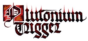
• heavy-metal band names ...
• brief quotations,
• heavy-metal band names ...
In fact Gothic suits any kind of short official or medieval-looking document for which impressive appearance is more important than legibility.
All Gothic alphabets are made up of dramatic, dark letterforms full of impact, contrast and detailed decoration. The overall Gothic 'feel' was well described by the great Edward Johnston in 1906:
‘Rightly made, and used, it is one of the most picturesque forms of lettering – and therefore of ornament – and besides its ornamental value, there is still in the popular fancy a halo of romance about “black letter,” which may fairly be taken into account.’
(Writing and Illuminating, and Lettering (London, 1994), p. 295)
 Less poetically, Gothic or 'blackletter' has been described by its detractors as looking like ‘fenceposts.’ This doesn’t stop those who love Gothic from thinking it’s the most bewitching and luxurious of all calligraphic alphabets.
The best colours to use are the traditional ones: glossy black for the body text, vermilion (bright orange-red) for capital letters or titles, and gold for decoration. Such a design makes even the brashest modern title look respectably antique:
 Notice, though, that -- as with heavy-metal bands -- it's easy for something so exaggeratedly serious to go too far and then it starts to have a comical effect. This makes Gothic useful for spoofs, too; it is, if you like, the Spinal Tap of calligraphy.
The most important calligraphy skills for writing Gothic letters are:
* Pen angle at 45 degrees
* Drawing straight vertical lines
* Drawing short, straight diagonal lines, both thin and thick, in different directions
* Small, controlled movements of the nib
* Rhythm!
![]() … usually in slightly curly Gothic letters.)
… usually in slightly curly Gothic letters.)
However, Gothic lettering in one form or another has been used all over medieval Europe at different times. Basically, it derives from around the time when Gothic architecture was the predominant building style in western Europe, and the lettering does indeed share some characteristics with the architecture, such as a heavy emphasis on the vertical, lots of decorative elements, and an ornate regularity of style.
Why was it so popular? And why is it still so popular today?
Nowadays, Gothic lettering is valued for its formal, striking, and ornamental qualities. (For this reason, it is best used for decorative purposes, where people don't need to be able to read the text easily.) A Gothic script has a very definite medieval ‘feel’ to it. And it’s not difficult to produce an impressive effect in Gothic, so it’s always been a favourite with calligraphers.
And why were those medieval monks in their day so besotted with a Gothic style of writing?
Believe it or not, mainly because a Gothic alphabet was cheaper to use than other calligraphic scripts! Gothic lettering actually evolved its dense, vertical appearance partly as a method of saving space. Its pen-strokes are very closely packed together. That means you can fit more words on a line ... more lines on a page ... more text in a book. And in the days when all books in Europe were written on animal skins, employing Gothic lettering in book-copying meant fewer animal-skins per copy. That brought production costs down.
 And that meant that more people could afford to buy such books … which must have meant more income for the scribes and illuminators ... which meant a better lifestyle ... which probably meant that more people became scribes or illuminators ... which meant, in turn, more available books again. It’s perhaps no coincidence that this was a period during which book-production in western Europe expanded rapidly outwards from the earlier confines of the monasteries and into secular scriptoria, where townsfolk made a decent living from it.
So Gothic was quite important in helping make books become more available. And the Gothic period is especially famous for absolutely tiny copies of the Bible that would fit into a small pocket. But, in fact, Gothic lettering was used to copy all kinds of less expensive books – not only Bibles – before the invention of printing. (It wouldn’t be fair to say ‘cheap books’ because even the less-expensive books cost more than many people could afford.)
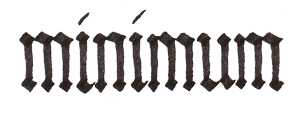
However, there was (and is) a downside to all this efficient saving of space and animal hides. Often, the lettering in Gothic texts is so closely packed together, so formulaic, so regular and rhythmic, that it is difficult to read them.
Look at this, for example:
 And that is part of the reason why, during the Renaissance period in Italy, a new script arose -- the humanistic or Renaissance roundhand script, which is an open, graceful, curvaceous calligraphic hand -- extremely elegant and easy to read!
(Humanistic roundhand was supposed to echo the clarity and learning of the great classical Greek and Roman thinkers and their no-nonsense scripts. It formed the basis of many printed fonts, developed into italic calligraphy, and established standards for modern handwriting. But that’s another story.)
Well – that has hopefully given you an inkling of the origins and uses of Gothic lettering. It’s a fascinating script from an extraordinary period of history.
All Gothic alphabets are made up of dramatic, dark letterforms full of impact, contrast and detailed decoration. The overall Gothic 'feel' was well described by the great Edward Johnston in 1906:
‘Rightly made, and used, it is one of the most picturesque forms of lettering – and therefore of ornament – and besides its ornamental value, there is still in the popular fancy a halo of romance about “black letter,” which may fairly be taken into account.’
(Writing and Illuminating, and Lettering (London, 1994), p. 295)
The best colours to use are the traditional ones: glossy black for the body text, vermilion (bright orange-red) for capital letters or titles, and gold for decoration. Such a design makes even the brashest modern title look respectably antique:
The most important calligraphy skills for writing Gothic letters are:
* Pen angle at 45 degrees
* Drawing straight vertical lines
* Drawing short, straight diagonal lines, both thin and thick, in different directions
* Small, controlled movements of the nib
* Rhythm!
Origins of Gothic Lettering
The word ‘Gothic’ derives from the name of the historical Gothic period when such alphabets were most used – basically, the Middle Ages from around 1200-1500.
‘Gothic’ also suggests Germanic origins, and it is indeed a very Germanic script. Gothic fonts were used in printed books in Germany right up to the twentieth century! (You can still see the traditional Gothic lettering on chemists’ and pharmacies’ signs in Germany; they say
However, Gothic lettering in one form or another has been used all over medieval Europe at different times. Basically, it derives from around the time when Gothic architecture was the predominant building style in western Europe, and the lettering does indeed share some characteristics with the architecture, such as a heavy emphasis on the vertical, lots of decorative elements, and an ornate regularity of style.
Why was it so popular? And why is it still so popular today?
Nowadays, Gothic lettering is valued for its formal, striking, and ornamental qualities. (For this reason, it is best used for decorative purposes, where people don't need to be able to read the text easily.) A Gothic script has a very definite medieval ‘feel’ to it. And it’s not difficult to produce an impressive effect in Gothic, so it’s always been a favourite with calligraphers.
And why were those medieval monks in their day so besotted with a Gothic style of writing?
Believe it or not, mainly because a Gothic alphabet was cheaper to use than other calligraphic scripts! Gothic lettering actually evolved its dense, vertical appearance partly as a method of saving space. Its pen-strokes are very closely packed together. That means you can fit more words on a line ... more lines on a page ... more text in a book. And in the days when all books in Europe were written on animal skins, employing Gothic lettering in book-copying meant fewer animal-skins per copy. That brought production costs down.
So Gothic was quite important in helping make books become more available. And the Gothic period is especially famous for absolutely tiny copies of the Bible that would fit into a small pocket. But, in fact, Gothic lettering was used to copy all kinds of less expensive books – not only Bibles – before the invention of printing. (It wouldn’t be fair to say ‘cheap books’ because even the less-expensive books cost more than many people could afford.)
However, there was (and is) a downside to all this efficient saving of space and animal hides. Often, the lettering in Gothic texts is so closely packed together, so formulaic, so regular and rhythmic, that it is difficult to read them.
Look at this, for example:
(Humanistic roundhand was supposed to echo the clarity and learning of the great classical Greek and Roman thinkers and their no-nonsense scripts. It formed the basis of many printed fonts, developed into italic calligraphy, and established standards for modern handwriting. But that’s another story.)
Well – that has hopefully given you an inkling of the origins and uses of Gothic lettering. It’s a fascinating script from an extraordinary period of history.
0 comments:
Post a Comment